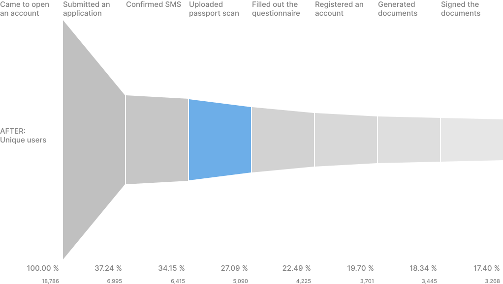
I’ve written a full, in-depth article about this case. If you want the complete story – the process, the techniques and the reasoning behind every decision – read it on Medium. In short: «Open Investments» brought me in to redesign the remote brokerage account opening flow, where the conversion rate sat at just 2.16%.


Problem: low conversion rate.
Research: I began by auditing the existing product – building a screen map with prioritised UX/UI comments grounded in design theory, then layering in marketing research, user feedback and fresh statistics. That work exposed the real problems: confusing requirements (an unnecessary temporary-registration document only 1% of users actually had), a disabled “Continue” button, broken drop zones, unsupported HEIC photos, and texts that gave no guidance until after a rejection.
Solution: I reframed these as hypotheses, validated optional steps with the legal department, and prototyped high-fidelity solutions – clearer texts, an animation showing how to photograph a document, and a gender-aware passport portrait for emotional warmth – all verified through corridor testing before phased A/B rollout.
Result: shipping the changes incrementally raised completion of the document-upload step from 57.8% to 79.3% – a 37% gain.
Insights: A more expensive passport data verification provider doubled the conversion rate for this step thanks to faster processing and fewer recognition errors. And because more data is recognised automatically, we have spared users the need to enter it manually. Ultimately, the gain of 2,500 new users per week brought the company far greater benefits than the cost of the new provider.
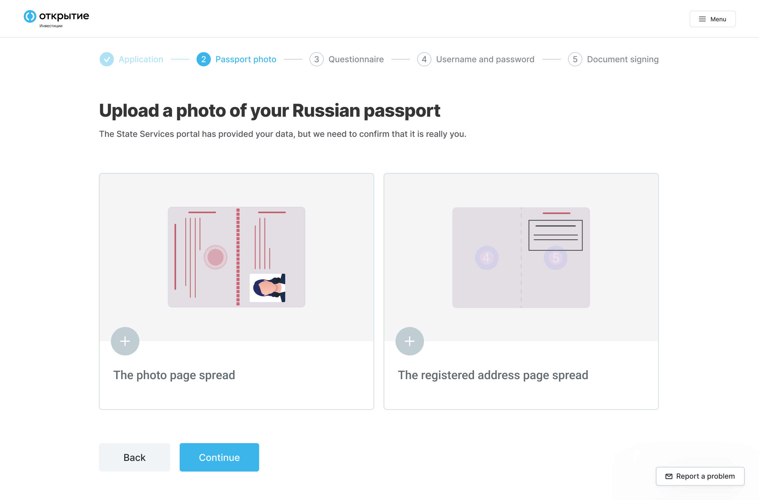
The old interface shows just 3 steps, but this is a misleading design. In reality, each step consists of sub-steps, and the progress bar moves gradually within a single step. Users sense that the design is misleading and perceive it as disrespectful. Instead of hiding the actual number of steps, I actually removed one step – Tariff. I wrote about this in the section Dealing with regulators.
Across the whole multi-screen account-opening journey – of which document upload is just one step – overall conversion rose from 2% to 17% (+750%), statistics gathered from tens of thousands of users.