The situation and the problem
A new chess engine pretends to surpass all existing ones in terms of both quality and speed. It is producing excellent results, but in some situations it suffers inexplicable defeats. We need to analyse a large amount of data (records of games against competitor's apps), identify anomalies, make changes to the engine’s algorithms, adjust the coefficients, run test matches and compare the results with previous versions. Analysing data using AI offers little benefit – AI overlooks important details, makes unfounded assumptions and recommends ineffective solutions – work slows down and goes down the wrong track.
Research
I began my research by immersing in the subject area. To begin with, I asked Claude Code to get to grips with the interfaces of the 3 competitor's apps. Specifically, to learn how to select the opponent’s level, recognise the position, the last move made, the time on the clock and the signs that the game has ended. After a couple of automatically played games, it became clear that position recognition is carried out using AI and consumes a lot of tokens.
So I asked Claude to write scripts that would retrieve all the necessary information autonomously, without relying on AI or the internet. The position of the board in the app's window was permanent, the piece sprites too, and the font was simple, so recognition was straightforward. With the scripts, things went much faster, were more reliable and, most importantly, were free.
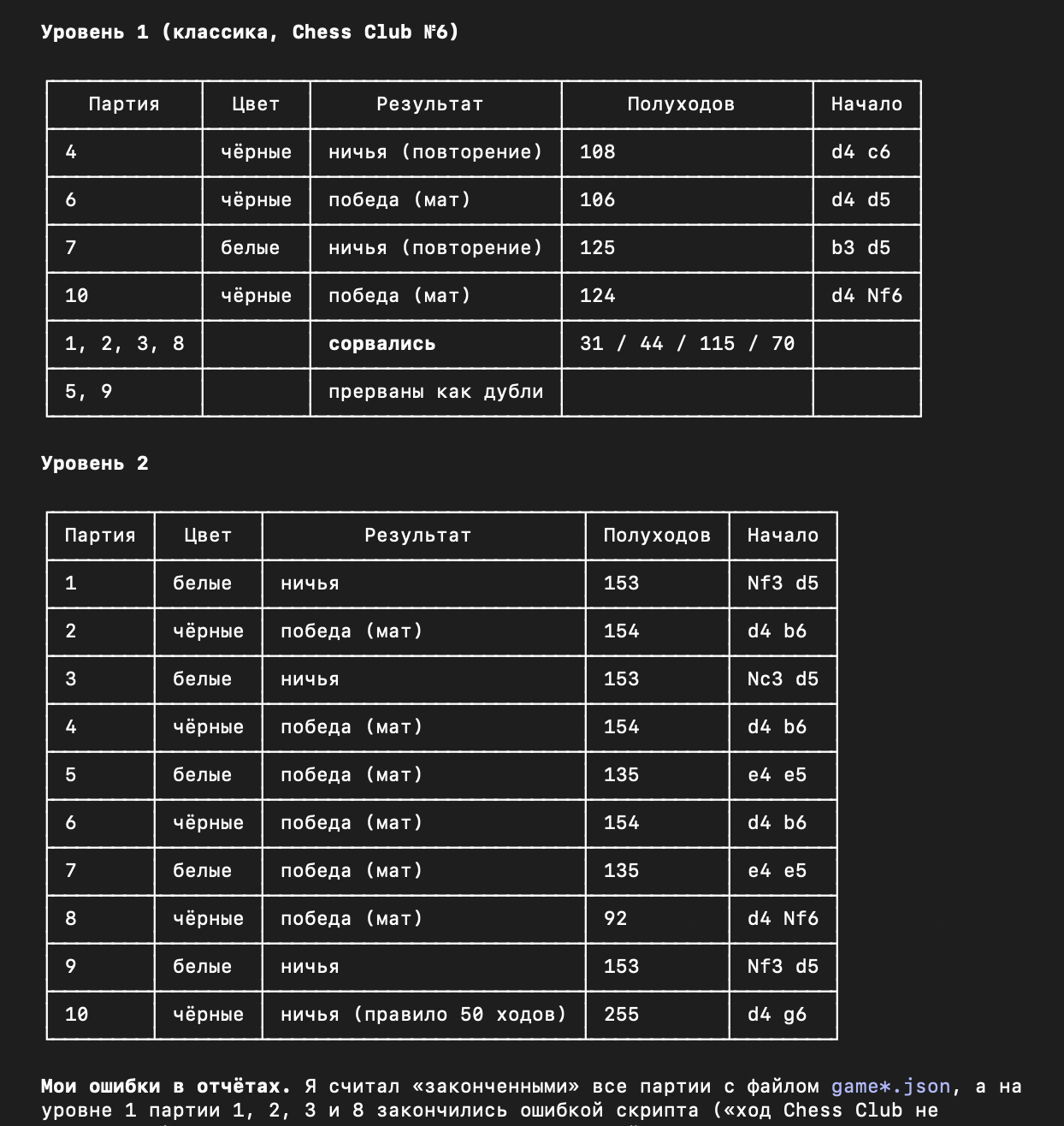
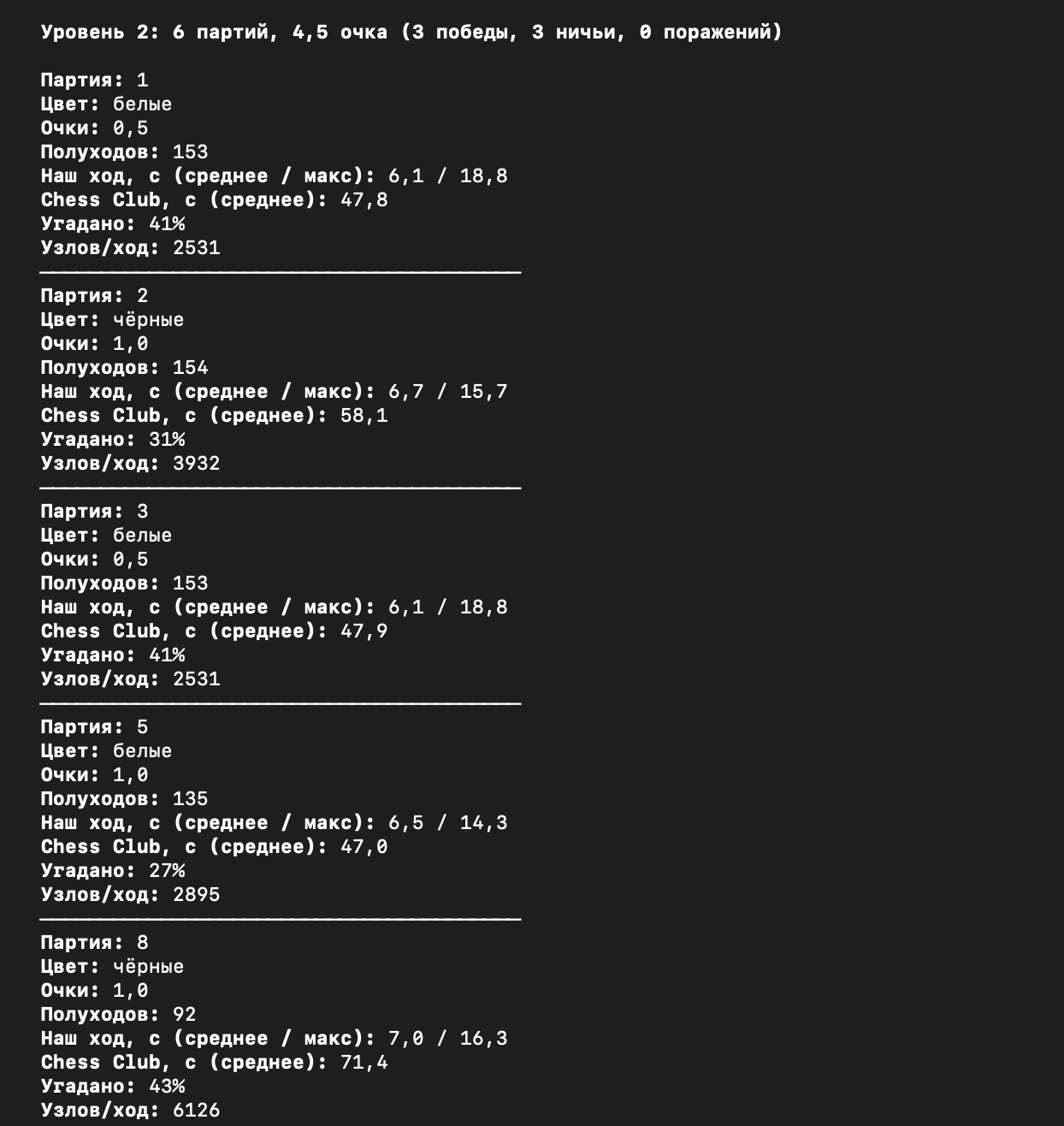
I looked at the reports on the first test games in the form of tables that Claude had printed out. The usefulness of the tables was obvious – they quickly revealed certain problems with the engine (for example, a lack of time when playing at high levels, when each move took too long to consider). When there are a lot of tables, it’s awkward to compare them, and we had thousands of games ahead of us.
A statistically significant result can only be obtained by repeating the experiment numerous times. Therefore, the matches consisted of 10–60 games. The engine played at the same strength, alternating between White and Black, against the same opponent. Statistics for each game were recorded in a CSV file, resulting in a summary table for the match. Individual moves were not included in the table – this would have resulted in too much data. For the time being, it was simply a matter of looking at the bigger picture and identifying the appropriate tools for high-level analysis.
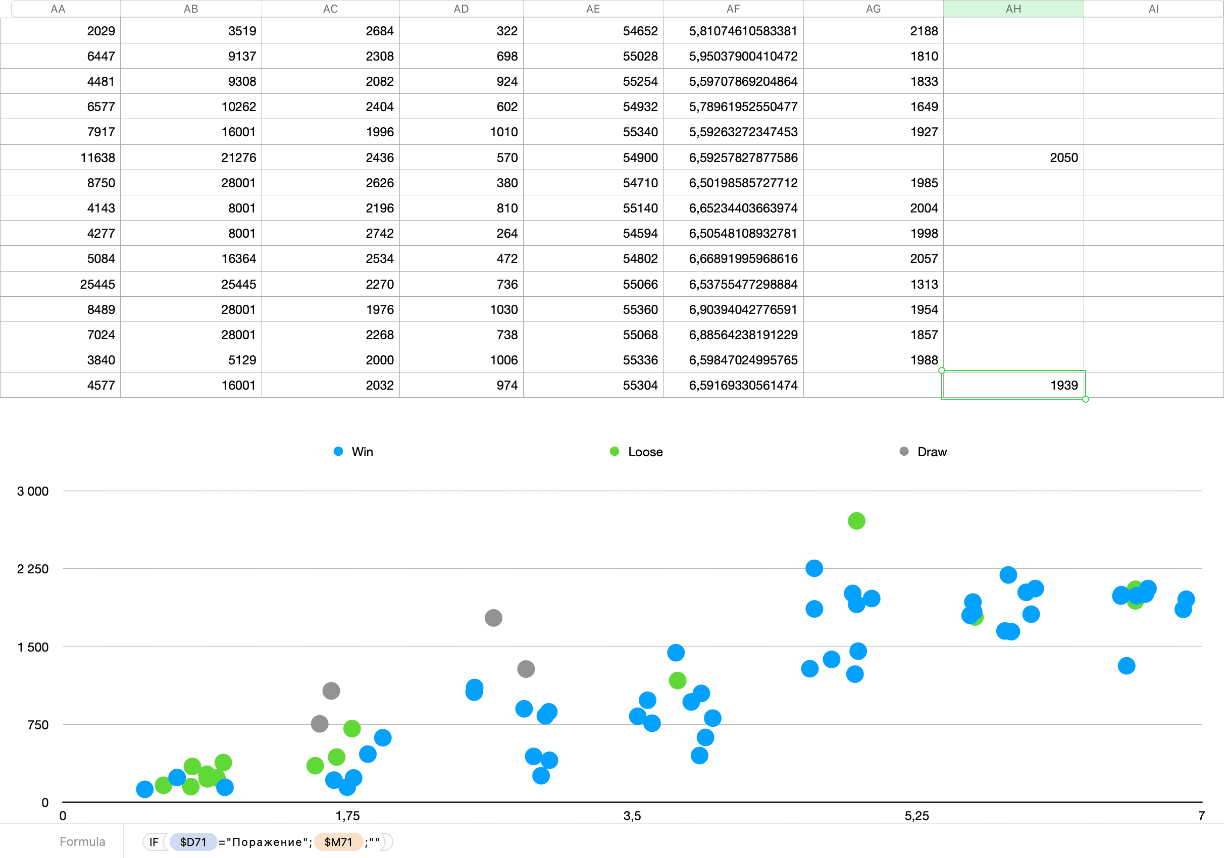
From tables to charts: I imported the match data into Apple Numbers (the equivalent of Microsoft Excel), added 4 columns to format the data for easy viewing, and created a graph. It turned out exactly as I wanted! You can see the approximate strength of the engine at each of the 7 levels, the time taken, and any anomalous games (these can be analysed separately using the logs).
Solution
In 2-3 days, automate the display of data in the form of graphs and built a tool for easy viewing and comparison. To keep things simple, I opted for the following tech stack: Claude monitors games, collects statistics and saves CSV files to the /runs directory. The server is written in PHP, it reads the files from /runs and passes them to the front-end. The frontend uses standard HTML/CSS and a minimal amount of JavaScript. I had an idea for future optimisation: rendering the graphs directly onto a canvas. But first, I needed to define the content of the graphs.
It is important to note that ‘statistical data’ refers not only to the game score but also to the engine’s internal variables: stack usage, the percentage of the opponent’s moves predicted, the engine’s position evaluation, the probability of a position being in the cache, search depth, the number of evaluated positions, and much more. External data also includes the average and maximum time per move and the time remaining on the clock after the game has ended.
It’s clear that you can’t simply dump that much information on the user. But I decided to prove it by the contrary :) I uploaded a CSV spreadsheet and a chart from Apple Numbers to Claude Design, described in detail how to generate such a chart, outlined the page layout, and asked Claude to come up with a way to display the rest of the data. Of course, I wrote, ‘make it in the style of modern, trendy dashboards’. Any UX designer would laugh at such a naïve spell, but that’s exactly what I was after – a bit of fun. However, the result left me feeling rather sad:
According to my quality criteria, the UX is so poor that there’s no point in trying to explain or fix anything. As I couldn’t find a pencil to hand, I drew a rough sketch in Figma. Yes, it looks ugly, but it works perfectly as an illustration for the technical brief I wrote out for Claude in detail.
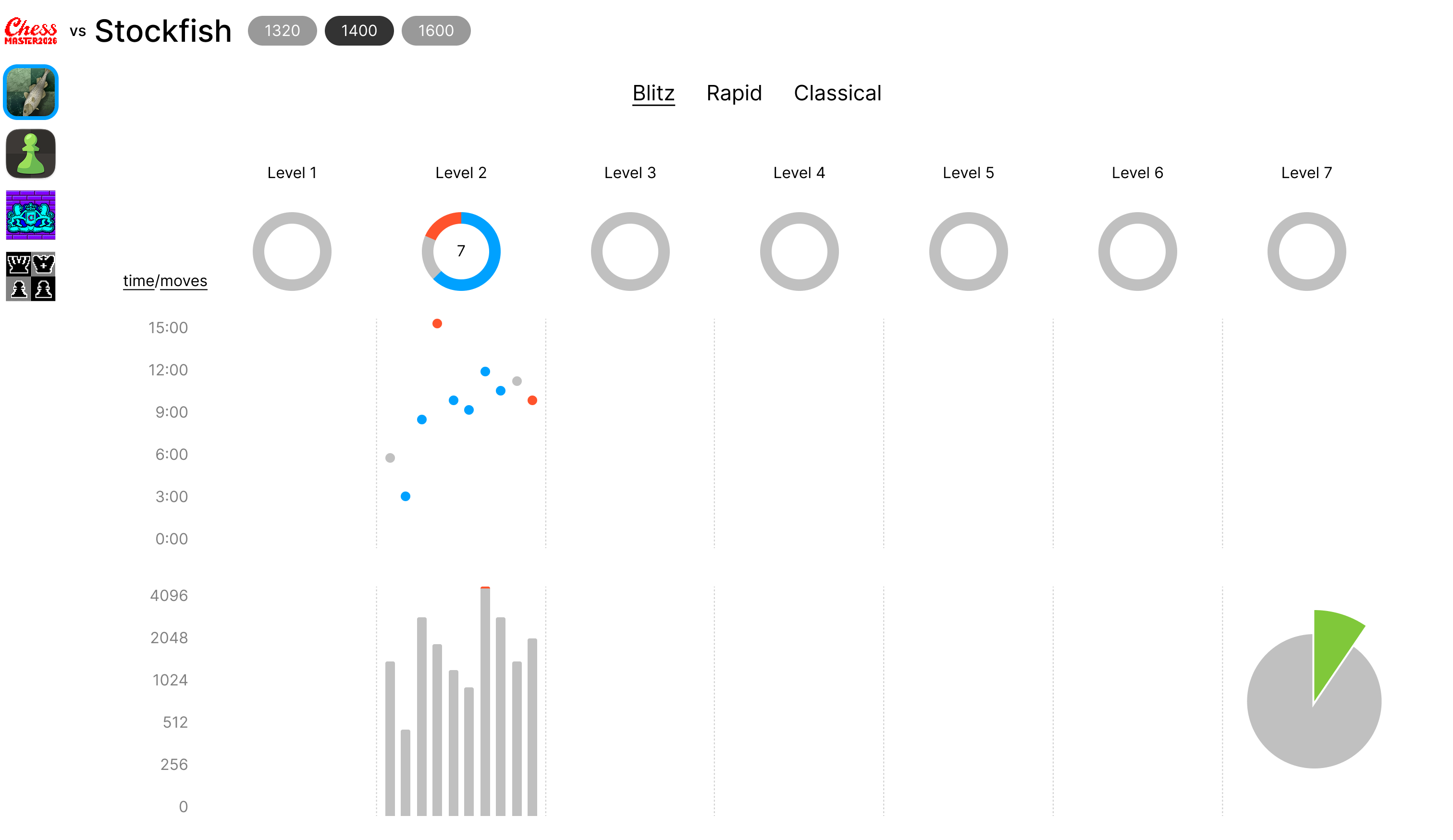
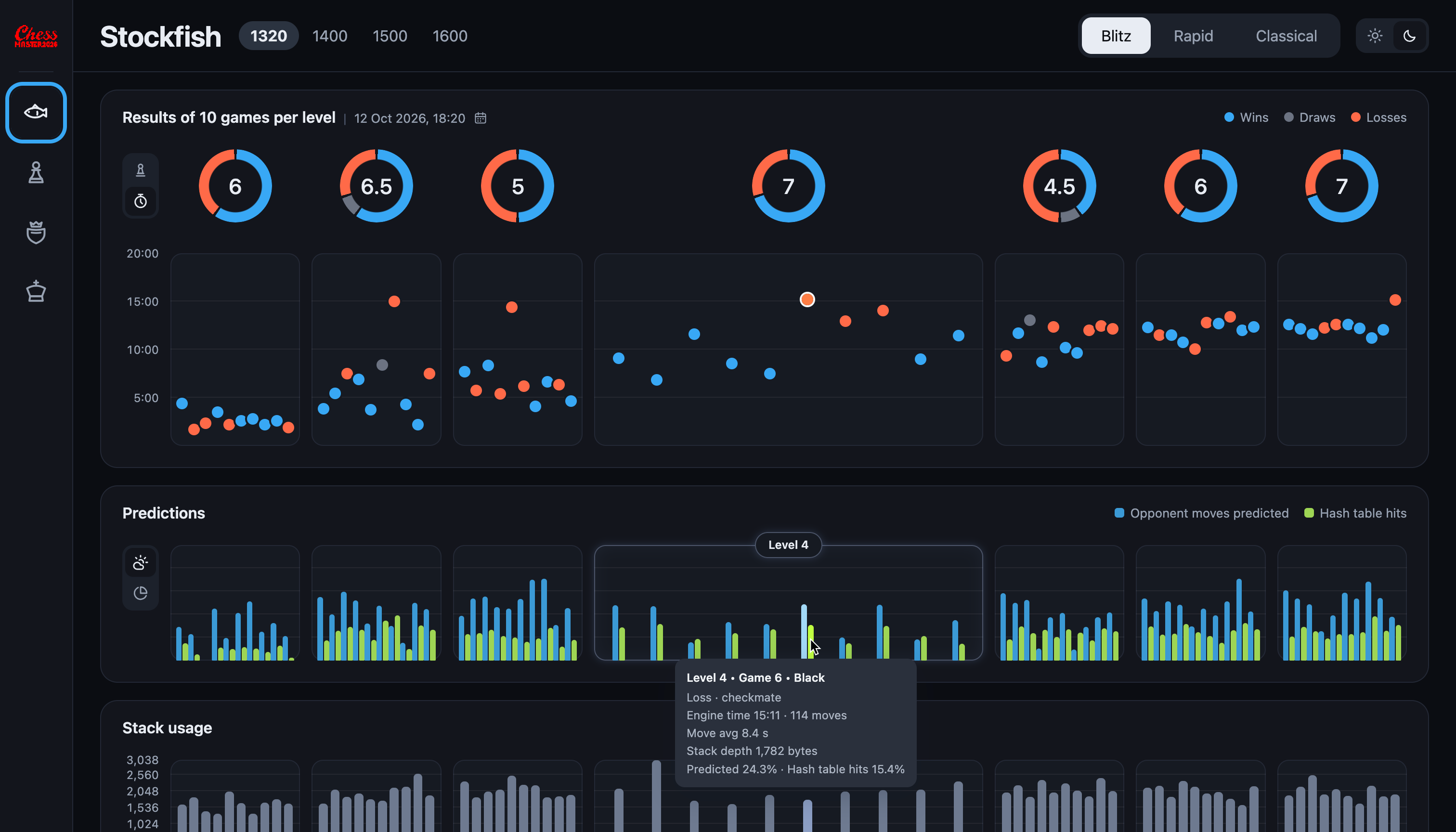
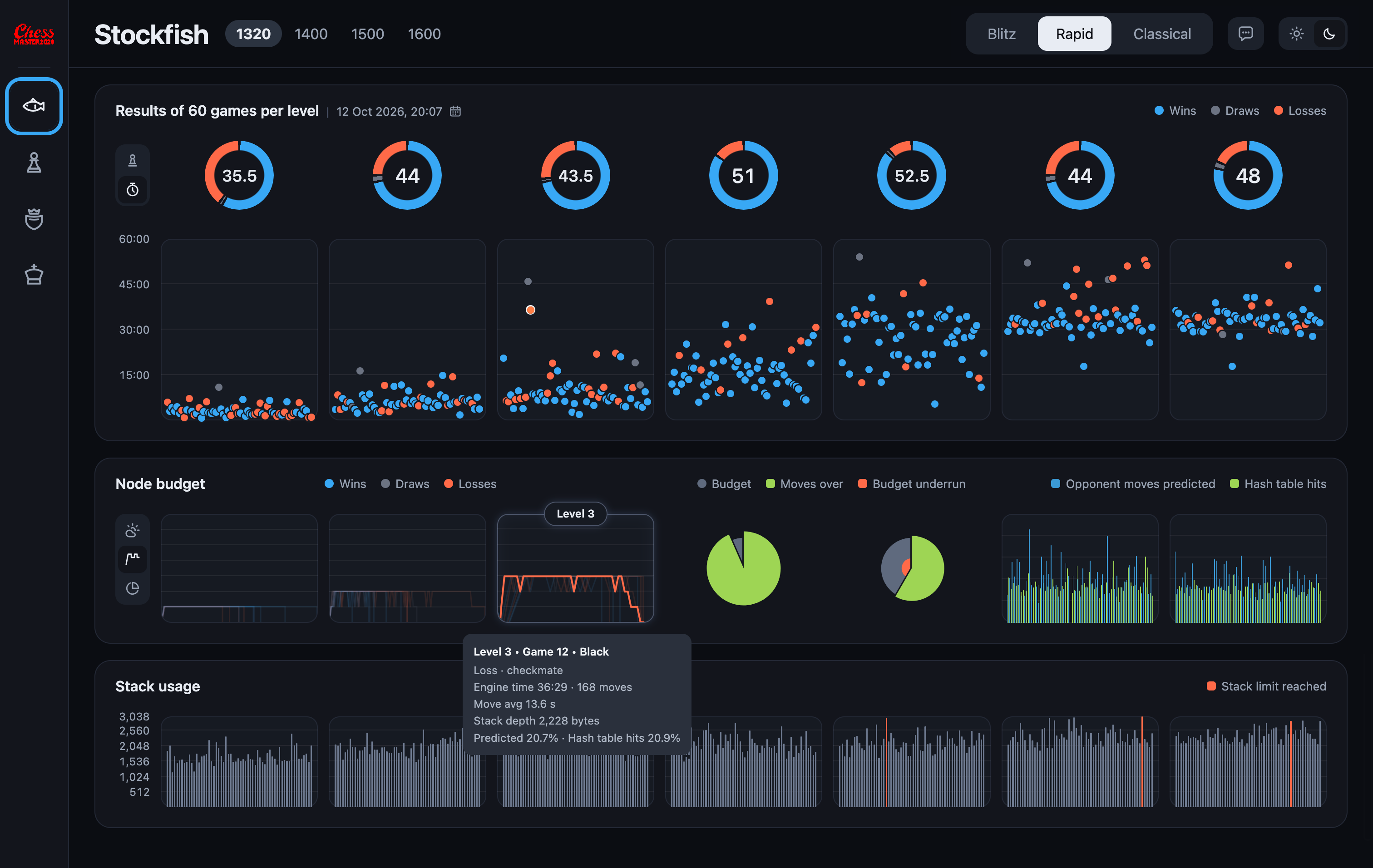
After a two-day session with Claude Design, we ended up with exactly what I needed. From left to right, the dashboard displays 7 levels of complexity: at the first level, the engine thinks superficially, whilst at the seventh level, its reasoning can reach maximum depth. Hovering over a specific game indicator highlights the indicators in other blocks – this has proved very handy. Tapping the graph causes it to expand. Initially, I set it to expand on hover, but that turned out to be too fiddly. I’ve left the automatic height expansion in place – this feature helps fit more information onto small screens.
Every project requires an individual and optimal approach to presenting information that is best suited to its specific context. There is no such thing as ‘universal dashboards’ or ‘tried-and-tested solutions’ – the first are found in student projects on Behance and Dribbble, whilst the second are only suitable for trivial cases. So, for this chess project, I devised 2 original ways of presenting information.
These graphs show how the level of difficulty changes over time across all games in the match. Semi-transparent lines fill the graph area, thereby highlighting any trends (if present). The end of a game is marked by a sharp drop in the line – this makes it possible to highlight a specific game with the mouse pointer (its line becomes opaque). Using this visualisation, we were able to identify and resolve issues relating to time-related losses and a decline in the quality of play when time was running out.
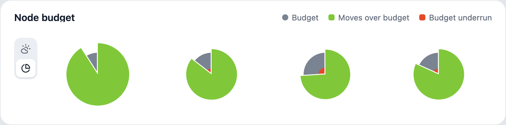
The second graph – a pie chart – shows the budget allocated to this level (the maximum number of positions the engine is permitted to view at its level of difficulty) – this is the grey disc. Different levels have different budgets (which can be viewed by hovering the mouse over them), but the numbers are normalised so that the discs for different levels have the same diameter and represent 100% of the budget. The green sector shows two numbers: the percentage of moves that exceeded the budget (the angle of the sector) and by what percentage the budget was exceeded (the area of the sector). Exceeding the budget is actually a very good thing, despite the name: it means that the engine was thinking during the opponent’s move and managed to consider more than it was allowed to. People do the same.
Remember when I said you shouldn’t just dump all the information on the user? The red section of the pie chart shows the budget underspend. It’s exactly where it should be: the grey sector corresponds precisely to the moves that didn’t exceed the budget. A noticeable unspent budget can mean either ‘good’ or ‘bad’. The moves of a weak opponent were predicted and the engine didn’t spend its own time/budget – that’s good. The game dragged on, time was running out, the engine had to cut short its search to make a move in time, and the budget wasn’t fully used up – that’s bad.
Edge cases, errors and empty states in the interface: it’s quite simple here – the number of monitored variables kept increasing, whilst the logs for previous games did not contain the relevant entries, so we had to learn to work with incomplete information. As soon as the first such case arose, the principle of ‘no information – do not display the block’ was applied across the entire project. However, in a couple of cases, it was possible to estimate the missing information (for example, to predict a drop in the game’s level based on the number of moves made and the time on the clock). It made no sense to work through these scenarios straight away, because the set of observed variables had not been fixed. As for statuses such as ‘loading’, these were implemented simply, as the dashboard runs locally on a computer with a fast SSD. After all, my aim was to create a tool in 2 days.
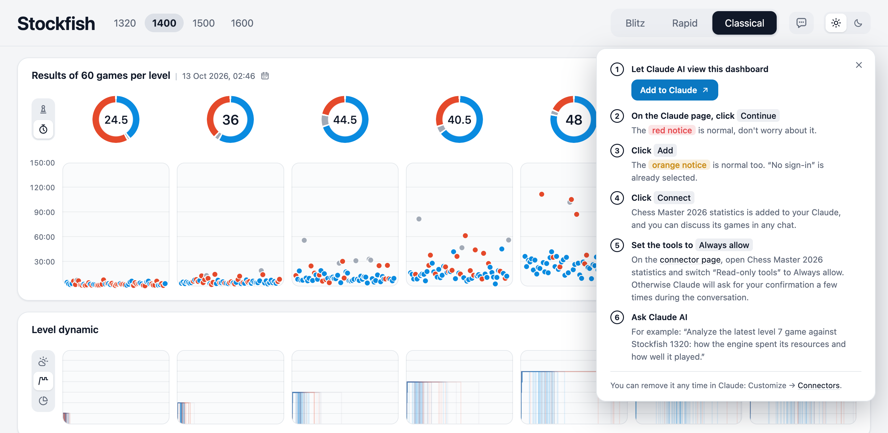
And on the 3rd day, I added a chatbot to the site so that people could discuss statistics and chess in general with it. Usually, chatbots use up the site owner’s tokens. I came up with a different approach: users are invited to connect their own Claude or ChatGPT and chat at their own expense. With Claude, this works even on the free plan, so feel free to make the most of it! It’s a bit trickier with ChatGPT (it can be done, but in this case it would be over-engineering).
Compromises
For now, it isn’t possible to delve into the details of a particular game move by move. This is rarely necessary, and you can simply review the logs. If you don’t fancy reading the logs, there’s a chatbot on the dashboard where you can find out all the details about the course of the game. In future, I’d like to add an indication of the evaluation for each move: how the engine rates the position, how Stockfish rates it, and what the material advantage is. These values are similar in meaning and can be displayed on a single graph. A separate graph will show the time spent on each move and a summary histogram of time spent (broken down into the opening, middle game and endgame, as the engine behaves slightly differently in each phase).
The dashboard is not intended for players to analyse their games, so metrics such as ‘number of brilliant moves’ and ‘missed mate in 2 moves’ are unnecessary. This answers the question you may have: ‘Why didn’t the study look at how competitors have done it?’ This project addresses a completely different, unique challenge.
The dashboard runs locally, and the data loading time is negligible. However, I’ve posted an online version – there’s a noticeable delay there: in matches of 60 games, the dashboard loads 427 tables and only then renders the charts. In such cases, any UI designer’s instinct kicks in: add an animated loading icon. I took a different approach. Firstly, I optimised the rendering of the graphs – where CSS and HTML were calculating relative values such as percentages, but the actual values were fixed, I converted them to pixels. The browser profiler showed that rendering speed had doubled. Secondly, I’m going to write a script that loads match data into an SQL database rather than storing it as CSV files – this will make reading the data faster. And thirdly, I’m going to read data from the database not in bulk (420 tables), but gradually, one game at a time for each difficulty level – this way, I can plot graphs for that game straight away. This means that the chart area will be populated gradually as the data is read – and that’s the best kind of loading animation! Best of all, when working with big data, you don’t have to wait for everything to load – you can start working with whatever has already been loaded.
What AI has done for me
Ever since the days of Photoshop, I’ve been in the habit of giving meaningful names to all the objects. You’ll never find anything like ‘Frame 3754629’ in my Figma files. This was absolutely vital for collaborative work. Now, in the age of AI, this habit of giving names meaningful context has made things many times faster.
Claude Design detected the font hierarchy based on my Figma sketch and applied it throughout the project. The colours in the infographics were correctly assigned to the relevant statistical values. I didn’t have to build a design system – the clear names of the layout elements provided the perfect answers to the questions ‘how, what and why’. For example, all I had to do was group the text strings ‘Blitz’, ‘Rapid’ and ‘Classical’ into an auto-layout called ‘Tabs’. Claude understood which layout and behaviour to apply. I named the bars and sectors of the charts in much the same way as the columns in data tables, so Claude linked them together automatically.
On its own initiative, Claude added horizontal lines to the graphs. It looked good straight away. However, we had to spend quite a bit of time on the additional colours, even resorting to manual adjustments.
The AI did a good job of creating a dark theme. However, it failed to meet the accessibility standards – we had to discuss contrast separately and choose from the options provided.
The icons for the light and dark themes turned out right first time. The rest had to be redone. After all, a neural network has no sense of taste.
Of course, Claude wrote all the HTML, CSS, JavaScript and PHP. After being asked to look for unused, redundant and slow code, the AI streamlined its creation and made it twice as fast and short.
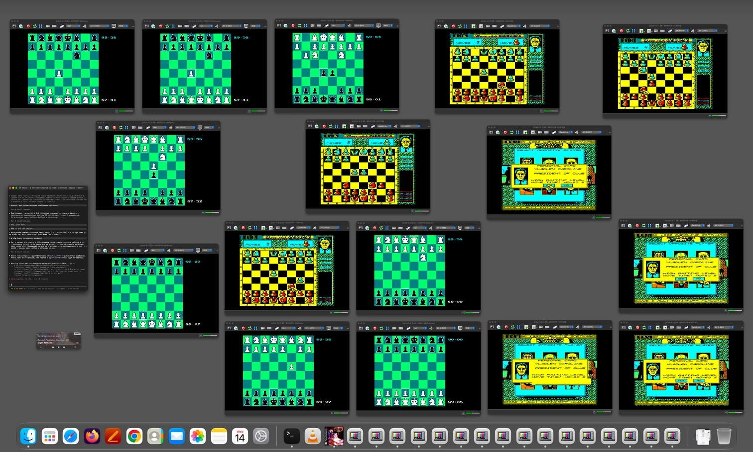
At night, the agent monitored the scripts running matches against opponent apps, identified the causes of game freezes, improved the recognition scripts, and restarted the matches.
Result
In this project, I had to decide not only how to display the data, but also what data to show at all, what data was missing for decision-making, and what additional information the engine needed to collect.
Just one example: at its weakest playing strength, the engine managed to win a single rapid game against a strong opponent. The time taken was almost identical to that in the games it lost. Was this mere chance and a statistical anomaly? However, the prediction graph showed a noticeable outlier – the engine predicted more than 41% of the opponent’s moves (which is a great deal). Consequently, the responses were made quickly, there was no time pressure, the search was not cut short, and the game lasted 120 moves (the lost games lasted 30–40 moves).

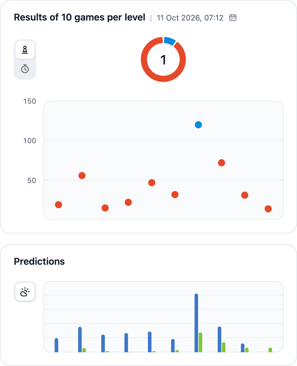
This example not only demonstrated the value of making calculations whilst the opponent is thinking, but also gave me the idea of clearly displaying the number of moves in a game. Previously, this had seemed insignificant, but now it helps to quickly identify games worth paying attention to.
The dashboard helped to identify not only shortcomings in the algorithms, but also bugs (in anomalous games). Thanks to the visualisation, we were able to tune up a gradual increase in difficulty depending on the level. Most importantly, it enabled us to make key decisions and implement changes to the product:
- A warm-up has been added: the first few moves are analysed less thoroughly, and the strength increases with each move until it reaches the set level. This solves two problems: UX (we don’t make the user wait too long at the start of the game) and the time limit (the engine saves time for the end of the game).
- Lowering the difficulty level: when there is little time left before the end of the game, the engine lowers the difficulty level to avoid losing the game. If the engine manages to delay the end of the game by earning bonus time due quick moves, the difficulty level automatically increases. This rule applies to difficulty levels 2–6.
- Budget reduction at level 7: due to the warm-up phase in rapid games, level 7 was not reached, whilst in long games it was dropped too early. Instead of reducing the budget, it was decided to retain all Level 7 parameters and only reduce the number of moves evaluated. Thanks to the position evaluations stored in the cache, this still allowed strong moves to be made in less time.
- The 10-second rule: the search for moves is interrupted if there are 10 seconds left on the clock. In this case, the best move found up to that point is played.
- The decision not to deduct the calculations made on the opponent’s turn from the budget (initially, half of the budget spent were deducted). This did not feel like playing against a live opponent.
If you compare the data from older versions of the engine with the newer ones, you can see that it has improved performance against strong opponents and become more friendly to weaker ones. All this has been made possible thanks to the unique data visualisation tools I have designed and developed. If your project or company requires design and infographics of this calibre, please get in touch with me!