At Yandex, I conducted interviews with real users – business owners who sell their products on the Yandex Market online platform (similar to Amazon). I asked participants to find their way around the interface of the sales calendar – a new B2B feature I had designed.
The image shows the first version, made for concept validation: do people understand the horizontal timeline and the metrics arranged vertically along it?
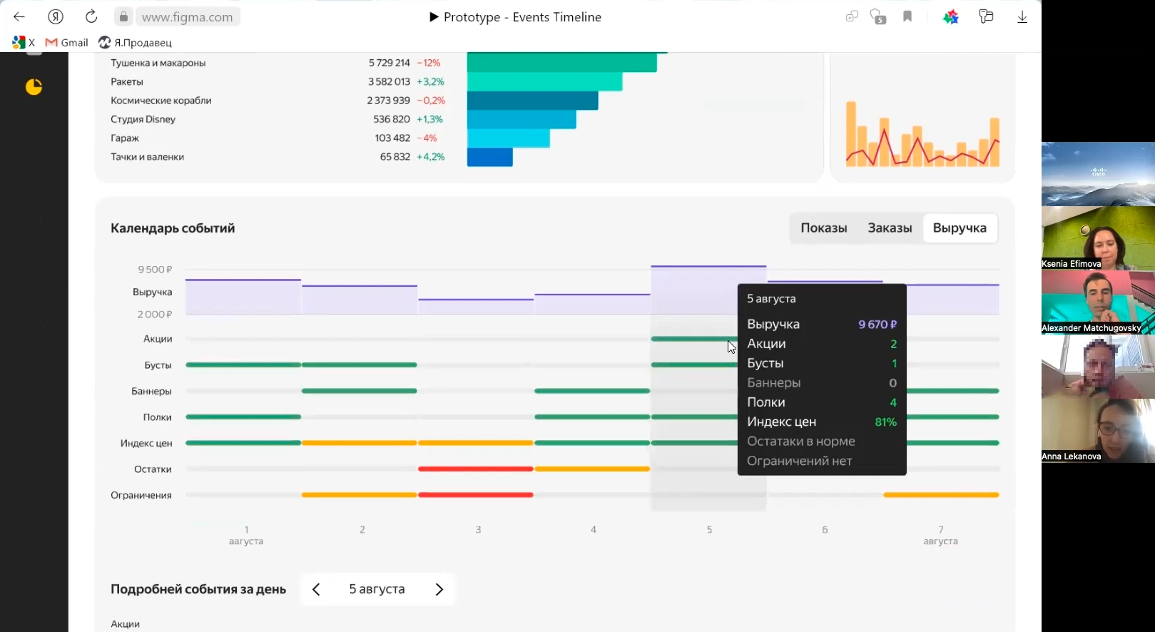
If we structure the description according to the situation-problem-task-solution-result framework, it’s quite straightforward: sales teams invest in advertising but don’t know exactly what benefits their expenditure on various product promotion methods brings, nor how to distinguish the contribution of promotional tools from other factors affecting sales.
I was invited to Yandex to take a fresh look at the problem and was tasked with designing an events calendar and shown some rough sketches. I quite quickly came up with the idea of a timeline (like in digital audio workstations) instead of calendar cells. After several iterations and user testing sessions, I arrived at the final design.
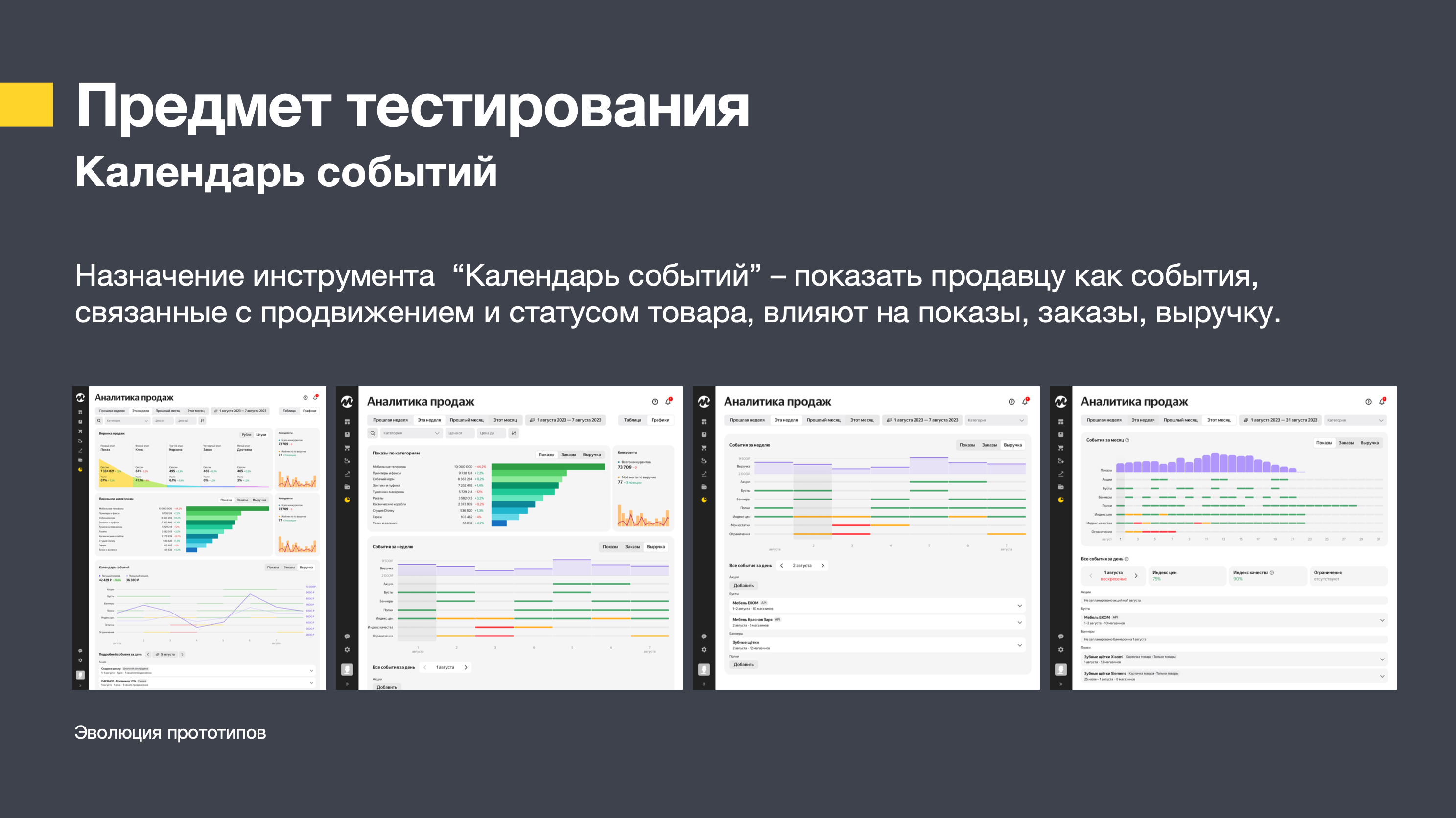
For Yandex Market, this events calendar became one of the key new features of 2023 and was unveiled with great fanfare at the annual partner conference. I can go into more detail during a face-to-face meeting, but here I’d like to focus specifically on user testing.

During testing, participants said they liked seeing the revenue figures, but they also wanted to see the actual size of the other metrics’ contribution (the share of discounted sales, the number of banner impressions and so on) rather than just good/bad signals in green and red. This request fitted in perfectly with the timeline concept – I had built in scalability from the outset.
UX research
Firstly, a Yandex UX researcher conducted a survey. A total of 573 sales staff volunteered to take part. Respondents were asked to indicate what information they had been looking for over the past month and what information they considered most important.
For two of these tasks, it turned out that 40% of sellers who had classified the task as important had not attempted to carry it out in the past month.
Frequency
Importance
The UX researcher put forward the hypothesis that sellers are unable to find answers to important questions due to a lack of relevant tools in the interface. The product owner decided to develop tools to analyse the impact of promotional campaigns.
How I prepare for an interview
At Yandex, there is a ritual called Designers Do Research – weekly sessions for testing scenarios on real sellers on Yandex Market platform. According to the guidelines, preparation for the test takes 3 days. Monday – drafting and discussing the test brief. Tuesday – recruiting respondents and announcing the test within the team (for those wishing to make use of the results). Wednesday – a test run. At all these stages, the designer is assisted by specialists in conducting interviews. Thursday – the test itself. Friday – a report on the results.
I have a great deal of experience in conducting interviews and sampling, dating back to my time working in advertising agencies, and I feel confident, but a little help is always welcome. The key thing in these calls is not to steer the respondent towards a particular opinion or action, but to set relevant tasks, observe, avoid prompting, politely decline requests for help, avoid leading questions, and note any changes in the respondent’s emotional state whilst taking their individual temperament into account.
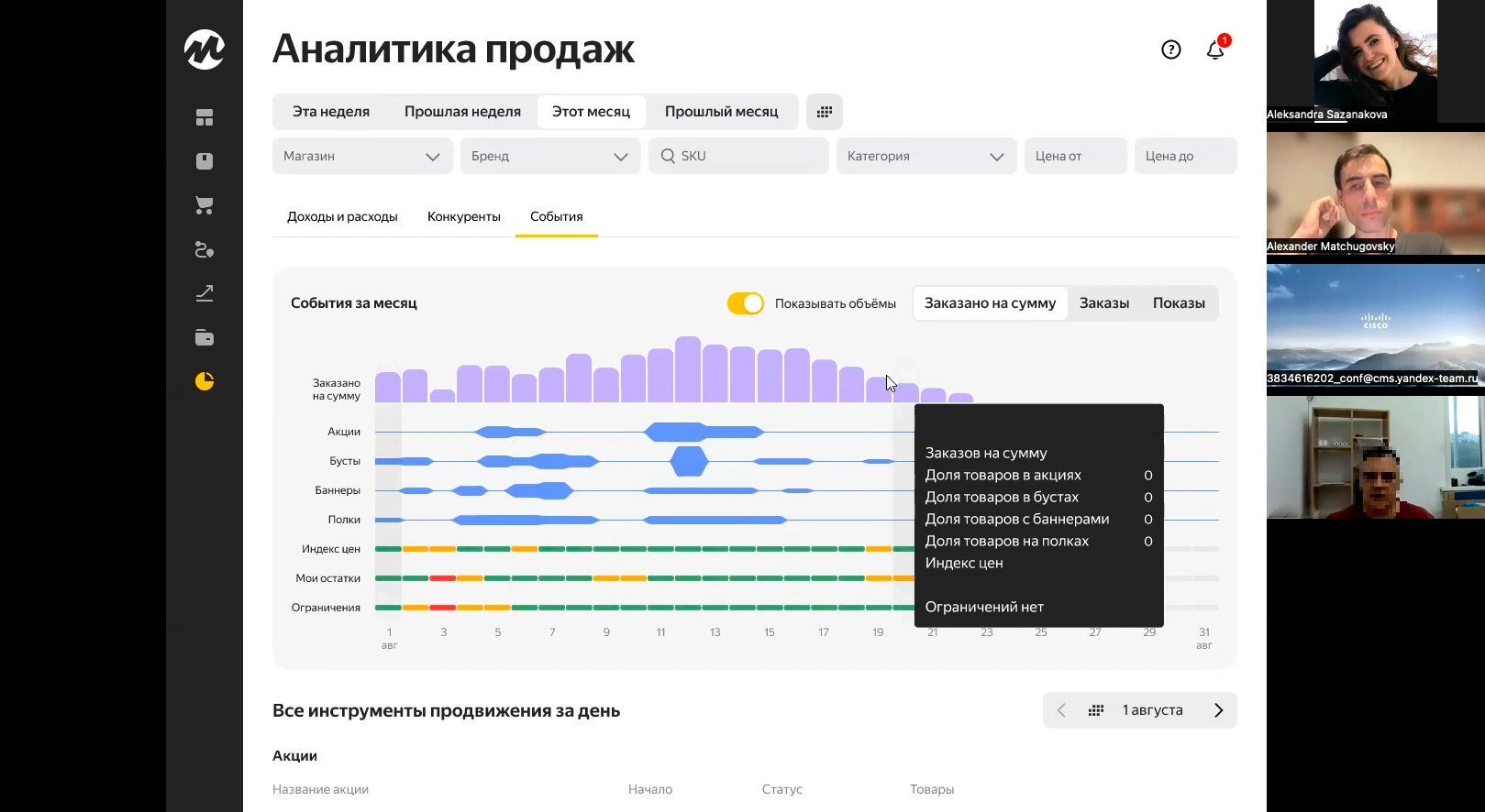
However, before carrying out testing on real users, we always conduct what is known as corridor testing with people who are genuinely willing to offer constructive criticism – friends, acquaintances, and company staff – provided, of course, that these people have no connection to the project. At Yandex, the results of corridor testing are compiled into a detailed report.
Crafting a prototype
The prototype should be set in a context similar to the real world so that the user has the most realistic experience possible. Only then will the test results be reliable, as we are testing a scenario rather than just a screen, and the user may want to deviate from the script. If there is a brick wall (the prototype isn’t ready), this will act as an unfair hint. To avoid this, it is worth making the Figma components of the project’s design system interactive, so that realistic prototypes can be quickly assembled from them.
Some designers say: Just throw something together – it’s only a prototype, you can optimise it later. They clearly don’t realise that good doesn’t mean long, and haven’t carried out enough real-world user testing. The real users don’t work on brand-new MacBook Pros like designers do – their computers’ performance is much lower, their screens aren’t as big, and the aspect ratios are different.
That’s why optimisation needs to be built in from the very start – not as an afterthought, but as an initial technical requirement for the prototype. If you bear this in mind from the very start, everything works out much more easily and quickly. The prototype must be fast and adaptable to any screen size.
Insights
The two most important findings from the two testing sessions:
- It is not enough for users to see colour-coded ratings such as good, neutral or bad. They prefer a precise assessment.
- Users suggest displaying a bar chart instead of a line graph – they find it easier to understand.
This second finding is particularly interesting, as it is consistent with the theory of infographics: line graphs are originally intended to display smoothly varying values (ranging from smooth mathematical functions to air temperature). In our case, however, we want to show a single value for each day: the total sales for that day. The sloping lines between days give the false impression that sales rose or fell linearly throughout the day and even at night.
In Yandex’s interfaces, many values are displayed in precisely this inappropriate way, and everyone in the company has got used to it. I found it difficult to explain that the problem even existed.
User testing results confirmed that design theory holds true, and my expert opinion was correct: test participants explicitly stated that the line-based representation was confusing and inconvenient. Fortunately, this was taken on board by the product owner and incorporated into the release.
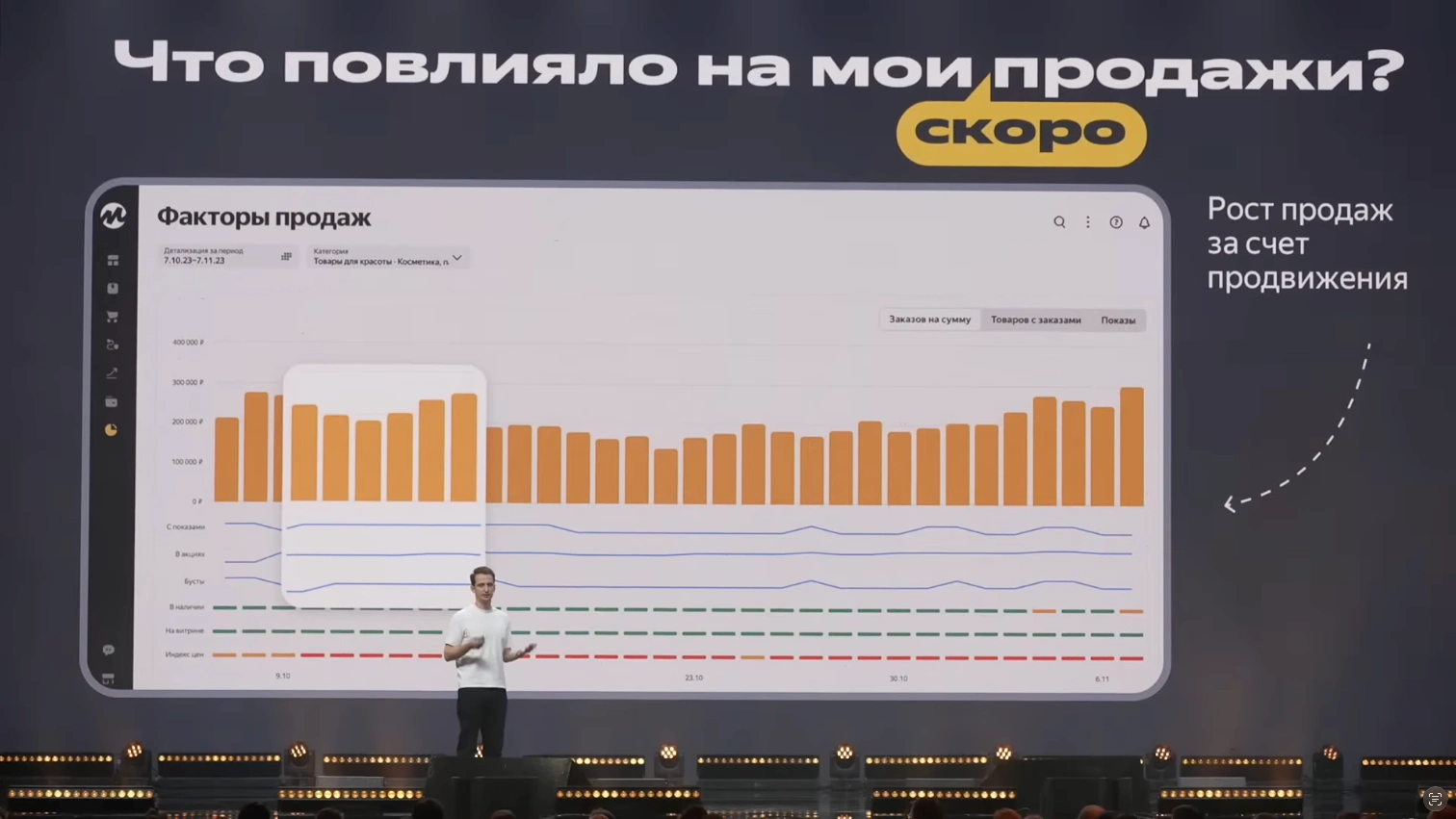
The only thing that still confuses me a little is the choice of colour for the bar chart. Yes, it’s Yandex Market’s corporate colour, but in terms of colour coding, it’s the same as the warning signal.